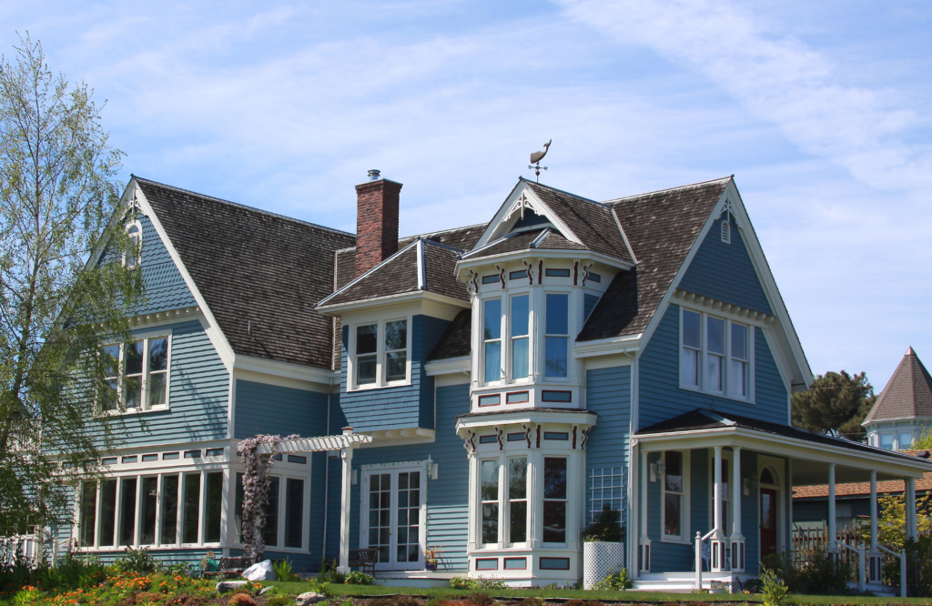
When it comes to the enchantment of homes, first impressions matter the most. There’s something truly magical about driving up to a residence with a captivating exterior. As you approach, the anticipation builds, guided by architectural elegance, meticulously landscaped surroundings, charming details, and a perfect color scheme that harmoniously blends with the surroundings.
The exterior color scheme of a home profoundly shapes its visual impact. It can convey the architectural style, influence perceptions of size, and enhance curb appeal, serving as a personal expression of the homeowner’s style while considering practical and climatic factors.
In this blog, we will be sharing 3 step guide for selecting statement-making exterior color schemes for your home…
Step #1: Consider Your Personal Style
When choosing colors for your home’s exterior, consider your personal style and preferences. Do you want your home’s exterior to have a bold, sophisticated, or classic look, or perhaps something eclectic and unique?
Keep in mind that different home styles often naturally convey certain feelings, so your color choices can enhance those vibes. Whether you aim for a warm, inviting feel or a more modern and sleek look, the colors you choose play a significant role in achieving your desired aesthetic.

Step #2: Work with a Pro to Fine the Perfect Palette
We help our clients narrow down their color palette options by carefully assessing various factors. While considering the home’s architectural style to ensure the chosen colors align with its character, we also take into account the client’s desired aesthetic, any neighborhood HOA requirements, and the architectural details they plan to retain, as these details should be enhanced and accentuated by the chosen colors.
This thoughtful guidance ensures a harmonious and tailored color scheme that aligns with the client’s vision while respecting the home’s unique attributes and neighborhood regulations.

Step #3: Choose Accent Colors for a Designer Finish
We like to make architectural details such as columns, stonework, shutters, trim, and doors pop. To do that and in rounding out a color scheme, we identify key architectural details and suggest accent colors that enhance their prominence.
Whether the accents are subtle or bold depends on the overall design objectives and the client’s preferences. Subtle accents can create an elegant and timeless look. Bold accents inject personality and drama into the design, and often, a balanced combination of both achieves the most striking and harmonious effect, allowing the architectural features to truly shine.

Bonus: Our Favorite Palettes for Different Home Styles
Classic colonial homes often look stunning in timeless combinations such as white or cream for the main body, paired with dark shutters in shades like black, navy, or forest green. These colors emphasize the traditional elegance of colonial architecture.

Victorian homes are known for their intricate detailing and can support a more vibrant color palette. Consider a mix of bold colors like rich purples, deep blues, and vibrant greens combined with cream or light beige to highlight architectural elements.

Craftsman homes often harmonize with earthy, muted colors. Opt for warm, neutral tones like olive green, deep brown, or rusty red for the body, complemented by crisp white or cream for trim.

Contemporary homes often embrace clean lines and minimalism. Cool grays, whites, and earthy tones like taupe and beige create a modern, sophisticated look. Bold accent colors, like deep blues or reds, can add a touch of personality.

If you’re ready for a professional to help pick the perfect palette for your unique home, we’d be delighted to help! Reach out today!
Cheers,
Sheeja

