For years, neutral palettes have dominated interior design, offering a sense of calm, minimalism, and versatility. Neutrals like grays, whites, and beiges have quietly set the stage with their understated elegance, allowing other design elements to shine. While timeless, these muted hues have started to feel a little…well, predictable.
Lately, however, richer, more vibrant colors have stepped into the spotlight, infusing spaces with fresh, dynamic energy. This evolution is invigorating, blending the classic sophistication of neutrals with the bold creativity of saturated hues.
In this post, we’ll share some examples that highlight how this trend is reshaping our approach to interiors.
Nature-Inspired Hues
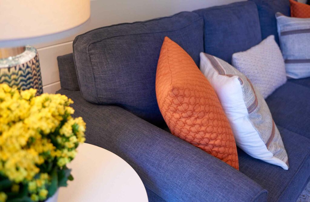
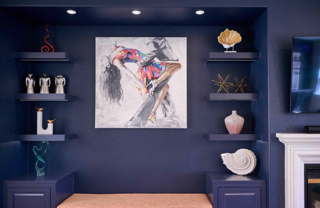
Nature-inspired shades have been trending for a while, but this year’s palette feels even richer and more grounding. Think deep olive and sage greens, warm umber and navy blues, and inviting cinnamon and ochre tones. These colors remind us of nature’s calming embrace, inspiring feelings of well-being and connection to the outdoors and evoking a sense of groundedness and security.
These hues add warmth without overwhelming a space—perfect for an accent wall, statement furniture, or even textiles like rugs, pillows, and drapes.
Sophisticated Jewel Tones
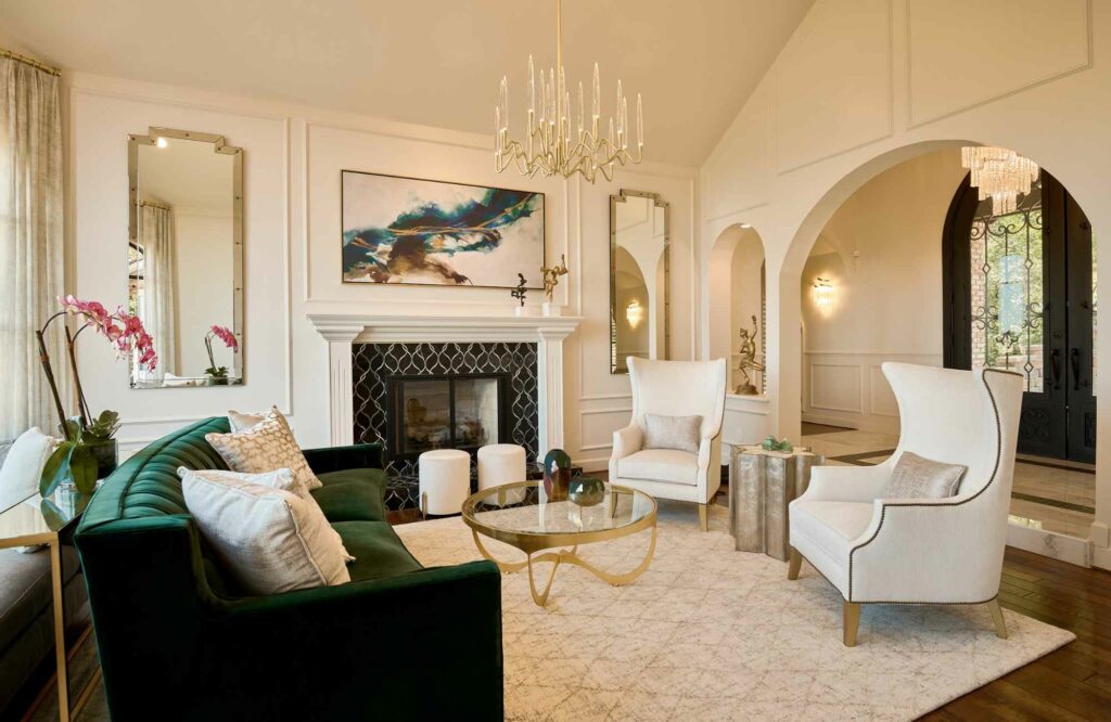
Emerald, garnet, sapphire, and topaz—these jewel-like hues are making interiors feel more opulent and inviting. Unlike flashy brights, these colors offer a refined sense of depth, evoking emotion and elegance in equal measure.
Whether it’s a sapphire-hued velvet sofa or an emerald-tiled backsplash, these shades add an instant touch of drama and luxury. They bring a bold yet elegant energy to interiors, making them ideal for creating moody spaces, cabinetry, statement pieces, and more.
Vibrant Natural Brights
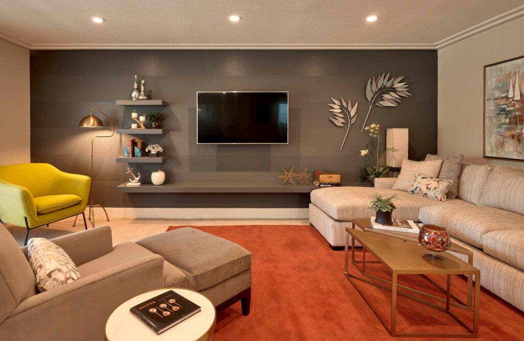
For those craving more vibrancy, nature is providing inspiration with hues like coral, cerulean, and lime. When used thoughtfully, these colors can pair beautifully with softer neutrals, offering the perfect balance of energy and harmony.
Coral instantly livens up a room, cerulean brings a breath of fresh air, and lime green adds an unexpected, playful twist. You can incorporate these shades through art, accent chairs, or statement pieces that inject personality without overwhelming the space.
For more design tips, read 3 Interior Design Tips to Elevate Your Space.
While trends come and go, the most important design rule remains the same—your home should reflect you. Whether you embrace earthy tones, deep jewel hues, or bold brights, the key is choosing colors that make you feel at home. If you’re looking to bring a fresh, personalized touch to your space, we’d love to help you find the perfect palette that speaks to your style. Let’s make your home as colorful as you are!
If you love your home, but feel less enthused with the current color palette, please reach out. We can’t wait to create YOUR richly-colored space!
Cheers,
Sheeja